Optimize Your Brand for AI-Powered Search with Altos EO+
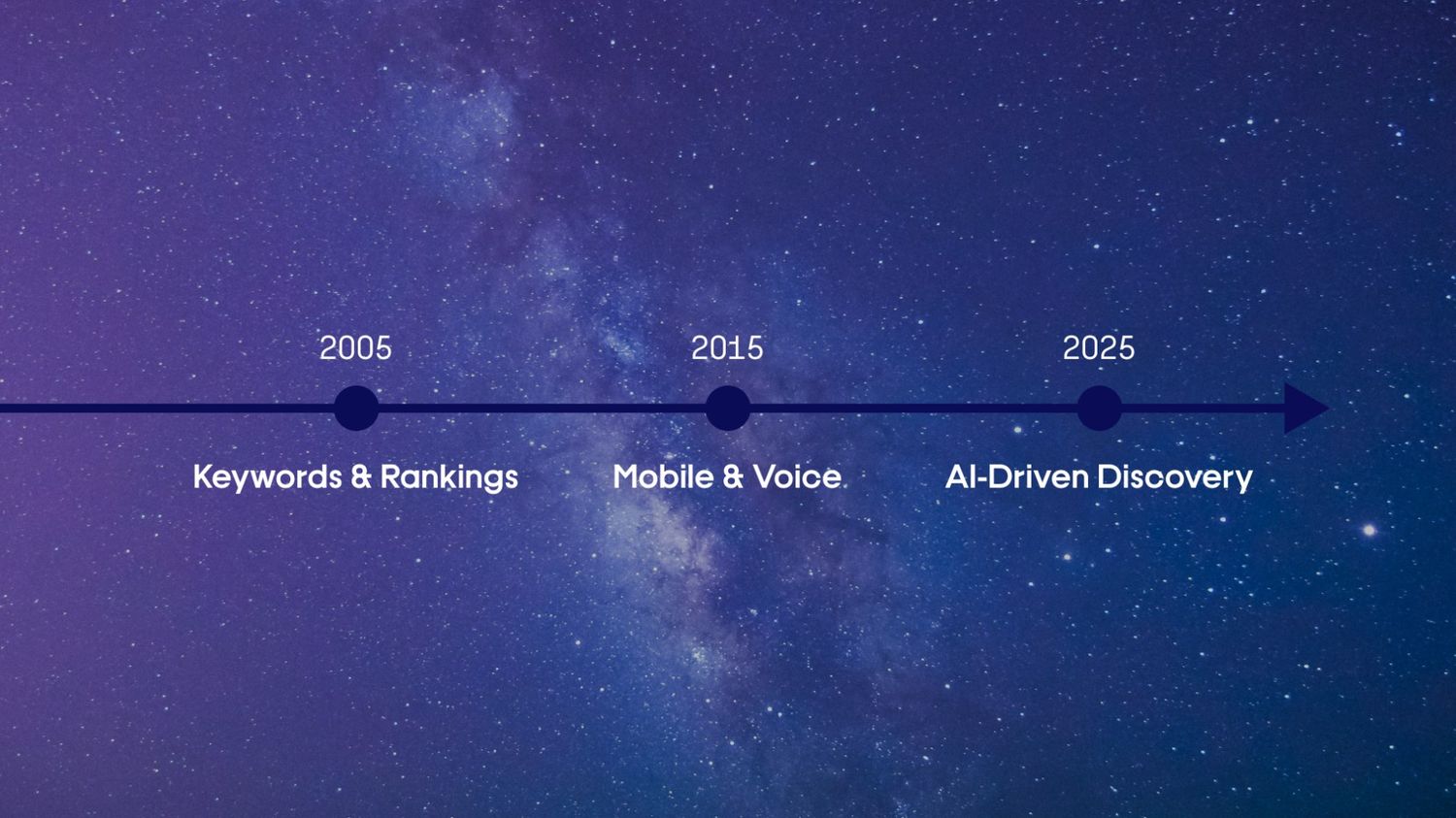
Search has changed. It’s no longer just about keywords, backlinks, and being on page one of Google. That’s why we created Altos EO+, a next-generation Engine Optimization solution designed to help your brand get found across today’s most critical engines of digital discovery.
%20(1).jpg)