Share
Web Navigation No-No’s: 8 Mistakes That Make For A Clunky Site Design

A website’s ease of use ultimately hinges on its navigation. Unless you want visitors to land on a single page before bouncing, navigation should be a top consideration as designers, developers, and copywriters come together to build a brand new website.
When you break it down, a website is merely a collection of information linked together by a combination of visual and text cues. These cues (ideally) work together to move a visitor through the site, especially to the information that’s most relevant or useful to them.
But because navigation is such an important part of the entire design process..there are plenty of opportunities for mistakes to creep in. And oh have these mistakes been made countless times throughout the history of the world wide web. Anyone who has been on the internet in the last 20 years can attest to that. Sometimes, the clunkiness just makes you want to...

But these mistakes are ones that future web designers can easily learn from—which is exactly what brings us here today. Let’s talk about 8 of those keyboard-bash-worthy, laptop-toss-inducing navigation mistakes that have landed themselves in web design infamy.
The Hateful Eight of Web Navigation
1.) Disregarding Convention
There are nearly 1.75 billion websites online today, which essentially means that your website is competing against about 1,749,999,999 others for the attention of the world’s internet users.
Naturally, that puts a ton of pressure on your site to stand out against the hefty competition—and makes the desire to be unique and different all too enticing.
We get it. But we’re also here to warn against the temptation of creating a site so “unique” that it becomes memorable for all the wrong reasons.
Remember when we mentioned how navigation really comes down to a set of cues? Many of those cues rely on a little something called convention: common combinations or configurations of text and/or visuals that internet literate users have come to know and understand.
These web conventions are what helps a user quickly get their wits about them when visiting a new site. They understand how to navigate from page to page, know where to look for contact information, and (most importantly) find the information that brought them to the site in the first place.

When convention, however, is thrown out the window for the sake of uniqueness, it becomes that much harder for a new user to get wherever they need to be. They might acknowledge how your site is unlike any other...but they’ll remember their own frustration more than your “interesting” web layout.
When striving for a new, eccentric, or different kind of website, try not to shirk convention altogether. Here are a few common rules that would be your best interest to adhere to:
- Make your main navigation menu easily visible
- Place your brand logo at the top left corner of the page
- Use intuitive iconography (a house icon for the homepage, shopping bag or cart to indicate an online cart, etc.)
- Implement a clear visual hierarchy to help users easily process each page
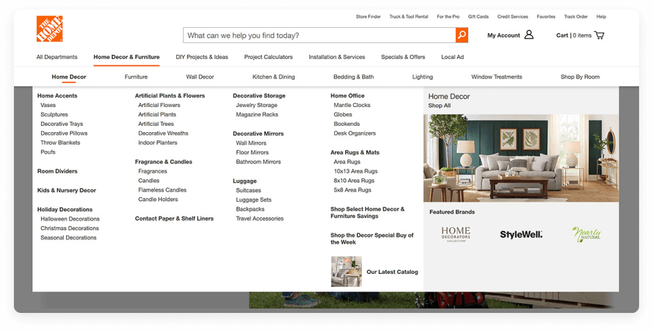
2.) Adding Too Many Menu Items
So your website has a lot of content. But even if your site has as much information to offer as Wikipedia, that still wouldn’t be an excuse to have more than seven (main) items in your main navigation menu.
Why? Because while you can adjust how information is categorized on your website, you won’t be able to change the fact that seven is the magic number for information processing. In the 1950s, famed Harvard psychologist George Miller studied how the human brain uses “chunking” as a mechanism for absorbing new information. He found that our short-term memory typically only allows for about seven “chunks” at a time.

Consequently, when you toss in more than seven menu items, you risk a couple of not-so-great outcomes. Best case scenario: a couple of your topics are paid no attention due to insufficient memory. Worst case scenario: your web visitors feel overwhelmed by the amount of information on the homepage.
So, if you can, keep your navigation down to seven main topics. If you feel you have more items that can’t go unmentioned, try at least grouping them up into seven categories.
But when you group these items up, be wary of…
3.) Misusing Dropdown Menus
Dropdown menus are much hated by the web development community, and not without reason. When used as part of a site’s main navigation, dropdowns are historically guilty of…
- Posing problems for SEO. Search engines can struggle with crawling items in the dropdown menu format.
- Slowing down users navigating from page to page. When users decide to click on a main navigation button, the sudden appearance of a dropdown menu can slow their progress.
- Being generally aggravating to use. Again: don’t let your site stand out for the wrong reasons!
While dropdowns can definitely be an attractive way of showcasing different subcategories of your site, consider keeping them away from your main navigation.
Instead, try combining the separate pages previously featured on a dropdown menu into a single, succinct page accessible via your top-level navigation.
Or, if you have space in your main navigation, consider replacing one of your top-level items with those featured in its former dropdown menu. This is a great way to remove dropdown menus that only feature 1-2 items.
If either of those alternatives aren’t vibing with your site, especially if it’s because you have a ton of available content, replace your dropdown menus with its handsomer, beefier, better received counterpart: the mega menu.
The Mega Menu is a multi-level dropdown menu with a more expansive & organized collection of options. The menu items are better structured inside a larger layout that allows for more formatting options (i.e. different typography,iconography, imagery, and 2D paneling). These obvious visual improvements over the regular ol’ dropdown menu makes the mega menu a more easily processable navigation option. Plus, where a dropdown menu might force you to hide some of your menu items, a mega menu offers up plenty of room to showcase it all.
Before you take the easy way out with a dropdown menu, consider the alternatives.
4.) Menu Inception: Needlessly Deep Menus
On the topic of menus, let’s jump to a discussion of two other kinds: flat menus & deep menus.
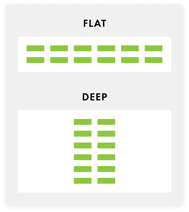
As you can see above, these menus are pretty much what they sound like. The hierarchy of a flat menu is...well, flat. The content is stretched across multiple different top-level categories, which limits the amount of subcategories across the site.
On the other hand, the deep menu sacrifices the amount of top-level categories in favor of multiple subcategory levels. There’s a ton of information that sits between a top-level menu item and its final subcategory—and that’s exactly where our main issue with deep menus arises.
Imagine that the bottom-level subcategory in a site’s deep menu is the content you, as a web visitor, want most. Imagine the number of actions you’d need to take before you get there. Also, if you weren’t 100% positive that what you want is actually at the bottom, each of those required actions would be an opportunity for you to lose interest and head somewhere else.
There are certainly ways where a deep menu can be formatted so that navigation isn’t as much of a long haul as we’re making it sound, but it’s not necessarily a walk in the park. In our experience, a flatter menu has been easier to format and easier for users to navigate.
If we could take a moment to give our personal opinion as well, as both web designers & every day web users, we definitely prefer to use a flatter menu more often than not.
5.) Vague (or Format-Based) Labels
With web navigation, sometimes there’s a fine line between clear and vague.
Think of using the word “Blog” as a top-level navigation label. Though it’s a short, simple, extremely common label, it still communicates to web visitors exactly what they’ll get if they were to click on it.
Same with “Contact Us.” It’s basic and run-of-the-mill as far as phrases go, but it’s also immediately recognizable as a CTA that will get users to some sort of contact page.
But what about “Services” as a label? Or “Products”? Do those ring the same recognizable bells? They might. But at the same time...they’re missed opportunities to showcase what your brand is and does.
Not to toot our own horn, but let’s take a look at one of our own web creations: the website for Hotel Saranac, a luxury, historic hotel located in Saranac Lake, NY. If you head over to hotelsaranac.com, you’ll see these menu items:
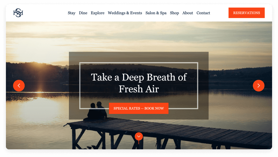
Look at the first three navigation items: Stay, Dine, & Explore. When you arrive at the homepage knowing that it’s associated with a hotel, these short, one-word labels are still pretty clear.
- Stay: sounds like it’ll direct to information helpful for booking, right?
- Dine: now we must be talking about food and dining accommodations.
- Explore: though not as explicit as the first two, this seems to suggest a path leading towards insights about the Saranac Lake area and other fun accommodations the hotel might have to offer.
Now, what if we decided instead to lump all three of these topics under the label “Services”? Is it just us, or does that seem unnecessarily vague?
Imagine if someone who landed on the Hotel Saranac site did not know (somehow) that it was a website for a hotel space. The term “Services” wouldn’t really do much to clue them in, whereas “Stay” and “Dine” do a lot more.
Similarly unhelpful are format-based labels, which inform visitors on the type of content they’re in for, but not what the content itself is actually about. Think “Whitepapers,” “Articles,” or “Videos.” These phrases might be fine for visitors who already have an idea of what kind of content is on the site, but not for visitors that are totally new to your brand.
Ultimately, being vague is quite different from being clear and concise, but it can be difficult to tell the difference. As you’re writing navigation items for your site, ask yourself “What does this phrase indicate to new and existing visitors?” If your visitors can look at the label and come away with some helpful insight, no matter how small, then you’re on the right track.
6.) Unnecessarily Hiding Navigation
On a new website, an easy way to get your bearing from page-to-page is to keep on eye on the navigation menu, which becomes difficult when the menu is automatically hidden!
While hiding the navigation with a hamburger menu is commonplace on mobile sites, where space is hard to come by, there aren’t many good reasons to hide the menu when space is plentiful on a desktop.
While some may opt to hide it in favor of aesthetics, we say there’s nothing aesthetically displeasing about a navigation menu. And at the end of the day, what’s a pretty site worth if it’s a task to get through?
That’s essentially what Nielsen Norman Group discovered when they studied the effects of hidden navigation on overall user experience. Higher difficulty ratings and lengthier task completion times were associated with hidden navigation.

Unless you’re competing for space on a pocket-size screen, let your top-level navigation see the light of day on your webpages.
7.) Ignoring False Bottoms On A Webpage
It’s only fitting to end this list with a note about bottoms—false bottoms.
Slightly different from the previous tips, this one has more to do with navigating within a single page, rather than between pages. Certain visual cues will mistakenly communicate to visitors that they’ve reached the bottom of the page...when in reality, there’s an entire collection of content hiding beneath.
When your page has content beyond what appears above the fold, that should be made as clear as possible to the visitor. CTAs and visual cues like downward arrows can be a hint that some users need to scroll on.
This is especially important when you have a large header image that takes up a lot of your homepage space. In fact, that sounds a little familiar to us…
Sometimes, users just need a little push in the right direction to ensure the rest of your page content isn’t pushed out of sight and out of mind.
graphic
8.) Optimizing Navigation ONLY On The Homepage
Just kidding, we have one more tip for you—the tip above was a false bottom (forgive us).
Your homepage is the hub of your website. It’s important that your navigation is clear from this place, where the majority of your web visitors will land on first. As long as your homepage navigation is spot on, it almost doesn’t matter what the rest of your pages look like...right?
WRONG.
We know you want to impress those first-time users that land on your homepage, but don’t do so while neglecting the importance of other page-to-page navigation. If you do, you’re just leading your visitors into a labyrinth they’ll be more than happy to take the easy way out of.
When you’re taking to heart these tips about navigation, don’t just use them to upgrade your homepage. See those practices through from top to bottom. It all boils down to accomplishing the following:
- Effectively utilizing design conventions to guide users through the site
- Providing easy, clear pathways to ALL of the available content
- Helping users understand & keep track of where they’ve been
Questions? We’re Here To Help
We hope this clears up some confusion you might have had about web navigation. How’d we do?
If you’re still confused, let us know so we can do a better job next time...and hopefully be of service on your next web design project!
See How Optimized Your Site is for AI
See how AEO and GEO engines interpret your brand, and how EO+ can unlock better performance across the board.
Let’s Talk Strategy
If you're looking for a partner who understands digital-first marketing and web design, we’re ready when you are.


